SOS — a KIAM studio case study
( Case Study ) — 02
SOS
الجمعية السعودية لطب العيونA visual governance system for a scientific body — built for daily use, not for display.
ClientSaudi Ophthalmological Society
ScopeIdentity · Governance · Environmental · Print
Year2024
SectorHealthcare · Non-profit

( 01 ) — Overview
A scientific body in a sensitive sector, needing an identity that balances scientific authority with medical neutrality. We built an orbital mark inspired by the iris around the national emblem, in a strict monochrome system.
Not a display identity but a governance system: usage rules built to survive many implementing hands — from building signage to letterhead to vehicle livery.


( 03 ) — Environmental & Signage
Building signs, wayfinding and outdoor advertising — the same system holds at every surface and scale.


( 04 ) — Fleet & Print
Vehicle livery and the print guide — the identity travels with the society.


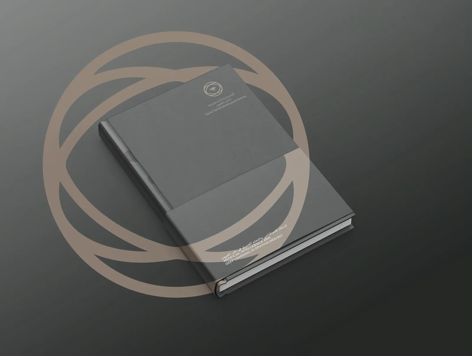
Studio — KIAMClient — Saudi Ophthalmological SocietySaudi Arabia · 2024
Share this project